Understanding Principal Component Analysis (PCA): A Comprehensive Guide
Introduction
Imagine you're a wine connoisseur with a penchant for data. You've collected a vast dataset that includes variables like acidity, sugar content, and alcohol level for hundreds of wine samples. You're interested in distinguishing wines based on these characteristics, but you soon realize that visualizing and analyzing multi-dimensional data is like trying to taste a wine from a sealed bottle—near impossible.
This is where the magic of Principal Component Analysis, or PCA for short, kicks in. Think of PCA as your data's personal stylist, helping your dataset shed unnecessary dimensions while keeping its essence intact. Whether you're dissecting the nuances of wine characteristics or diving into the depths of machine learning algorithms, PCA is your go-to for simplifying things without losing the crux of the data.
A Deep Dive into the Mathematics of PCA
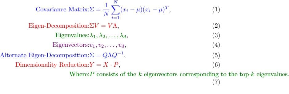
Step 1 : The Covariance Matrix
Let's assume you given a 2D dataset X of size (n×2) (where ( n ) is the number of samples. Each row in X represents a data point in 2D space, with the first column representing the x-coordinates and the second coordinates representing the y-coordinates. The first step in PCA is to calculate its covariance matrix ∑:
$$\Sigma = \frac{1}{n} \sum_{i=1}^{n} (x_i - \mu)(x_i - \mu)^T$$
Here xij represents the ith row in X (a 2D point), and μ is the mean vector of the dataset. The term (xi - μ) represents the deviation of each point from the mean, and (xi - μ)T is its transpose.
Step 2: Eigen Decomposition
After calculating ∑ Next, we perform eigen-decomposition of the covariance matrix. This allows for finding its eigenvalues and eigenvectors. The eigen decomposition of ∑ can be represented as:
$$\Sigma = Q \Lambda Q^{-1}$$
Here Q is a matrix where each column is an eigenvector of ∑ and Λ is a diagonal matrix containing the eigenvalues λ1, λ2, ..... λd in descending order.
Step 3: Principal Components and Dimensionality Reduction
Let's say you have now found k eigenvectors (principal components) that you would like to use for dimensionality reduction. These k eigenvectors form a 2 x k matrix P.
The projected data Y , in the new k-dimensional space can be calculated as:
$$Y = X \cdot P$$
In this equation, X is the original n x 2 dataset, and P is the 2 x k matrix of principal components. The resulting Y will be of size n x k, effectively reducing the dimensionality of each data point from 2D to k-D.
Implementing PCA with Python
Here's a Python code snippet to get you started with PCA:
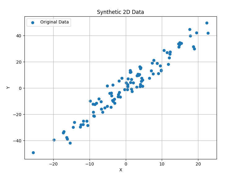
Data Generation: First let's generate some synthetic data with 100 samples in a 2D feature space between x and y coordinates. This sort of mimics the real-world data where features are often correlated.
 import numpy as np
 import matplotlib.pyplot as plt

 # Generate synthetic 2D data
 np.random.seed(0)
 x = np.random.normal(0, 10, 100)  # x-coordinates
 y = 2 * x + np.random.normal(0, 5, 100)  # y-coordinates
 data = np.column_stack((x, y))
Data Visualisation: Let's visualise what our generated data looks like.
# Plot the synthetic data
plt.figure(figsize=(8, 6))
plt.scatter(data[:, 0], data[:, 1], label='Original Data')
plt.xlabel('X')
plt.ylabel('Y')
plt.title('Synthetic 2D Data')
plt.grid(True)
plt.legend()
plt.show()
- Data Centering: Before you can apply PCA, it is essential to center the data around the origin. This ensures that the first principal component describes the direction for maximum variance.
# Calculate the mean of the data
mean_data = np.mean(data, axis=0)

# Center the data by subtracting the mean
centered_data = data - mean_data
- The covariance Matrix calculation: The covariance matrix captures the internal structure of the data. It is the basis for identifying the principal components.
# Calculate the covariance matrix
cov_matrix = np.cov(centered_data, rowvar=False)

print('Covariance of Data',cov_matrix)
$$\text{Covariance Matrix} = \begin{pmatrix} 102.61 & 211.10 \\ 211.10 & 461.01 \end{pmatrix}$$
Code output:
Covariance of Data [[102.60874942 211.10203024]
                     [211.10203024 461.00685553]]
- Eigen Decomposition: Here we calculate the eigenvalues and eigenvectors of the covariance matrix. The eigenvectors point in the direction of maximum variance, and the eigenvalues indicate the magnitude of this variance - since the first principal component is the eigenvector associated with the largest eigenvalue of the data's covariance matrix. This eigenvector identifies the direction along which the dataset varies the most.
# Calculate the eigenvalues and eigenvectors of the covariance matrix
eig_values, eig_vectors = np.linalg.eig(cov_matrix)

print('Eigenvalues:', eig_values, '\n', 'Eigenvectors: ', eig_vectors)
$$\text{Eigenvalues} = \left[ 4.90, 558.71 \right]$$
$$\text{Eigenvectors} = \begin{pmatrix} -0.91 & -0.42 \\ 0.42 & -0.91 \end{pmatrix}$$
- Projection and Visualization: Our data is then projected onto the principal component. The original data with the principal component, and the projected data are then plotted together to further emphasize the dimensionality reduction.
# Choose the eigenvector corresponding to the largest eigenvalue (Principal Component)
principal_component = eig_vectors[:, np.argmax(eig_values)]

# Project data onto the principal component
projected_data = np.dot(centered_data, principal_component)

# Re-plot the original data and its projection with the principal component as a red arrow

# Plot the original data and its projection
plt.figure(figsize=(10, 8))
plt.scatter(data[:, 0], data[:, 1], alpha=0.5, label='Original Data')

# Draw the principal component as a red arrow
plt.arrow(mean_data[0], mean_data[1], principal_component[0]*20, principal_component[1]*20,
          head_width=2, head_length=2, fc='r', ec='r', label='Principal Component')

# Plot the projected data as green points
plt.scatter(mean_data[0] + projected_data * principal_component[0],
            mean_data[1] + projected_data * principal_component[1],
            alpha=0.5, color='g', label='Projected Data')

plt.xlabel('X')
plt.ylabel('Y')
plt.title('Data and Principal Component')
plt.grid(True)
plt.legend()
plt.show()
Output:
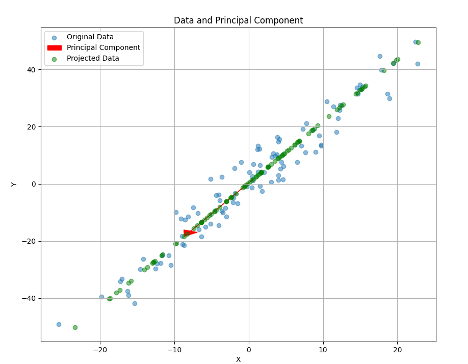
There we go—the red arrow representing the principal component is now visible in the plot, along with the original data points and their projections (in green). The arrow points in the direction of the highest variance in the dataset, capturing the essence of the data in fewer dimensions.
Why does the PCA point in Downwards left?
You might have noticed that the red arrow, our principal component, points towards the bottom left. IS this supposed to happen? Absolutely, and here is why:
The direction of the principal component is calculated mathematically to capture the maximum variance in the synthetic dataset. This direction is defined by the eigenvector corresponding to the largest eigenvalue of the covariance.
Simply put, the principal components serve as a "line of best fit" for the multidimensional data It doesn't necessarily mean an alignment with the x and y axis but it captures the correlation between these dimensions. In this specific synthetic dataset, the principal component points towards the bottom left, indicating that as one variable decreases, the other tends to decrease as well, and vice-versa.
This is a crucial insight because it tells us not just about the spread of each variable but also about their relationship with each other. So, yes, the direction of the principal component is both intentional and informative.
In case you would like to run the full code use the replit window below:
Real-world Applications
In the Glass: Wine Quality Estimation
Let's circle back to our wine example. You could use PCA to distinguish wines based on key characteristics. By reducing the dimensions, you can visualize clusters of similar wines and maybe even discover the perfect bottle for your next dinner party!
Beyond the Bottle: Other Fields
Data Visualization: High-dimensional biological data, stock market trends, etc.
Noise Reduction: Image processing and audio signal processing.
Natural Language Processing: Feature extraction from text data.
Future Directions
Kernel PCA: For when linear PCA isn't enough.
Sparse PCA: When you need a sparse representation.
Integrating with Deep Learning: Using PCA for better initialization of neural networks.
Further Reading
For those who wish to delve deeper into PCA, here are some textbook references:
"Pattern Recognition and Machine Learning" by Christopher M. Bishop
"The Elements of Statistical Learning" by Trevor Hastie, Robert Tibshirani, and Jerome Friedman
"Machine Learning: A Probabilistic Perspective" by Kevin P. Murphy
Conclusion
In the realm of data science, PCA ages like a well-kept Bordeaux—it only gets richer and more valuable as you delve deeper. This versatile approach is more than just a mathematical trick; it's a lens that brings clarity to your analytical endeavors. So whether you're a wine lover seeking the perfect blend, a data scientist sifting through gigabytes, or a machine learning guru, mastering PCA is like adding a Swiss Army knife to your data analysis toolkit.